Love and Science has been running ads for all kinds of companies for all kinds of years. As a result, we’re still connected to a good number of ad accounts we’re no longer actively managing. This means that multiple times per day, we get emails saying “Your ad was approved,” showing the ads the new managers are now running.
As a curious guy, I tend to look and see just what has been approved. Sometimes I laugh, sometimes I cry, but oftentimes I’m left thinking “this should not have been approved by the company it represents.”
While I don’t have the gumption to take on former clients, the team and I have made a quick roundup of some of the good, the bad, and the ugly ads that are floating around costing their companies money right now. We’ve also provided some constructive criticism to help these guys right their ships if they ever happen to stumble upon this article. We’re generous like that.
What Makes A Good Ad?
We’re pretty much just looking at image-based ads, so I grabbed Micah Jones (Love and Science’s VP of Brand + Design) to weigh in. While there are plenty of technical considerations to be aware of (dimensions, file sizes, HTML5 vs. static images vs. .gifs, etc.), he thinks the most important components are:
- Clear branding
- Clear offer
- Clear CTA
I totally agree.
Without looking at his list (we wrote ours down in private before sharing with each other), my top consideration was “always prioritize clear, concise messaging” – a dumb guy’s all-inclusive version of Micah’s list. Basically, you want to make sure you’re not requiring too much of the user’s mental processing power before they’re asked to make a decision.
So, What Makes A Bad Ad?
Basically the exact opposite of Micah’s list: unclear offers, unclear branding, and unclear (or missing) CTAs. When your ads’ messages are unclear, you lose.
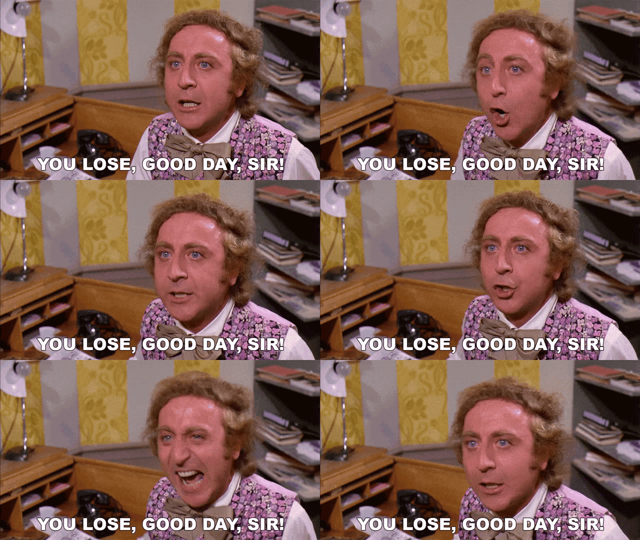
If the average person in your audience doesn’t immediately get what you’re doing, or has to “work through” what your ad represents, you’re screwed. Nobody has time to clean up your mess.
Now that we know what a bad (or at least “less than ideal”) ad might look like, let’s look at some examples out in the wild:
Kiehl’s

This ad feels like a mess to me. It took me way too long to piece together what’s happening, and the longer you look at it, the weirder it seems to get.
The saving grace for me is that I know that Kiehl’s makes lotions. Even still, my eye went right to the tattooed lady’s arm, and whatever the hell she was putting on or about to remove from said arm. At first I thought it was some kind of tape or nicotine patch. Then I got distracted by the skull with flowers coming out of it. Then I saw the pastry bag squeezing pancake batter into a container. WHERE AM I?!
Because I’m inquisitive, I took a second to look for other cues. I worked my way from left to right, hitting the main copy of “re-fill on head-to-toe hydration” – maybe that’s lotion? I looked back at the lady’s arm, lotion-bias in hand. It still doesn’t look like lotion to me (why is it so rectangular?), but I can accept that it is what I’m seeing. Go left again, and see the Kiehl’s branding. My lotion bias has been confirmed.
But wait, there’s more! Then I noticed the snow flake, which made me then reconsider the weird geodesic orange on the right that I had previously just ignored because my brain couldn’t fathom it. With the context of a snow flake on the copy, I’m now assuming that the orange mystery shape is a stick-on ribbon bow that you add to a wrapped gift.
That was a lot of mental work. Maybe I’m just the worst case scenario viewer of the ad, but I feel like this could have been much clearer without the weird images and adornments. Here’s the worst part: I am the target audience. Every Christmas, I buy my wife a bunch of Kiehl’s stuff. But I still couldn’t figure it out.
So how could they improve? I would first say to drop down to one single image – probably a product shot. This ad is specifically for a RE-fill, meaning it’s for someone who already knows that you put the lotion on your arm. We don’t need to see it in action.
Here’s what’s really interesting: when you go to the Keihl’s refill page on their site, you get hit with a banner that I think is actually an improvement on the whole ad:

I think you could stick with the original ad, but replace the two right-side images with the pouch/container image from the banner above and call it a day. Bonus points if you ditch the weird ribbon thing and use that orange-y color for the CTA button instead.
YouTube x NFL Sunday Ticket

I almost didn’t include this ad, as the more I thought about it the more I could convince myself it was OK. But here’s the thing: I shouldn’t have to convince myself.
Yes, it feels a little visually messy, but I think that’s OK – it gets the point across that you’re watching football on Youtube. The messaging feels like a bit of a miss, though.
“Don’t miss the rest of the ‘23 NFL Season at a lower price <GET IT NOW>“
It reads a little AI to me, but again, maybe that’s just me. What’s hard here is that I know what they’re saying, so I can’t knock them for a confusing message. But it doesn’t feel like effortless recognition to me. I still have to use up mental processing power to make sure I’m understanding what they’re promoting.
How about these alternatives:
- Watch all the NFL action at a new, lower price <JOIN NOW>
- Watch the rest of the ‘23 NFL Season at a lower price <Get Sunday Ticket>
Don’t bury the lead – keep it simple and straightforward.
Xfinity Mobile
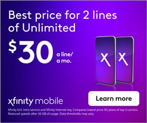
I’m no designer, but the layout is what’s really killing me here. I feel like the CTA button should be below the offer.
I also think the CTA button is kind of a buzz kill. A white button with black text that says “learn more.” Gee, sounds great. Let me go learn a bunch about phone contracts.
The main thrust of the ad is promoting this supposedly worthwhile offer of 2 lines at $30/mo per line. Why not make the CTA something about capitalizing on the offer? Get It Now, Buy Now, Get Offer, etc.
Beyond that, I think the messaging isn’t super compelling or clear. Is this Xfinity’s best price for 2 lines (that I can potentially beat with another provider), or is this the best price, period, for 2 unlimited phone lines anywhere across this great land?
I don’t know if this is true or not, but how about these options?
- Get the nation’s lowest price for 2 lines of unlimited now. $30 a line/ a mo. <GET OFFER>
- Get our lowest price for 2 lines of unlimited today. $30 a line/ a mo. <GET OFFER>
Make it actionable, and toss in some urgency for good measure.
Rhino-Rack

I hate this ad. I hate it. I hate that:
- The CTA isn’t a button
- The CTA is visually subservient to the phrase “GEAR A LIFT”
- “GEAR A LIFT” is weighted so heavily when it doesn’t even mean anything (I checked – they don’t sell any kind of lift. You do the lifting yourself in order to use the gear they sell)
- The small, busy image doesn’t even really show you what you’re supposed to be buying – you almost can’t even tell she’s reaching to the top of a truck
Kind of like Kiehl’s, when you click the ad to the landing page, you’re hit with a banner that I think is actually a better ad than the ad itself:

You have an encapsulated CTA button, a much easier to comprehend image (that includes readable Rhino-rack branding on the product), and copy specifically calling out what the product does – transport your gear.
How about these alternatives:
- Keep your winter gear high and dry <Shop Carriers Now>
- Elevate your winter gear <Shop Carriers Now>
Indeed
On the surface, this ad really isn’t so bad. It’s kind of a throwaway, though – it’s a nice sentiment, but what does it mean? What are you offering? Is this for job seekers or job providers?
Clicking through to the landing page, it turns out that it’s an ad targeting those doing the hiring, not those looking for a job. The premise is that Indeed offers some automated services that handle a lot of the paperwork process so you, as the hiring manager/whatever, can just focus on the interviews and onboarding.
You’re not really setting appropriate expectations on the front end of that click. Why not get a little more detailed? Here are some potential options:
- Spend less time on paperwork and more time finding the perfect candidate <Automate Your Process>
- Focus more on personnel, less on paperwork. <Automate Your Process>
WHIRLPOOL x Care counts
This is an actual ad I saw in the wild. That’s it. It’s not a .gif, it’s not HTML 5 with some additional scenes that haven’t yet loaded at the time of my screenshot – it’s literally just this one, single image.
I clicked through to get some kind of context to whatever the heck this is, and it’s a nice little program! Whirlpool is installing washers and dryers in schools and helping to provide underserved kids with clean clothes.
There’s really nothing you as a user can do other than learn about the program and explore some stats on the impact of dirty clothes and graduation rates. That doesn’t necessarily mean they shouldn’t run ads for the program – I think it’s a nice branding play if nothing else. But this ad isn’t doing them any favors.
The sole reason I clicked was because I was keeping an eye out for bad ads, and this one stuck out like a sore thumb. There’s no information, there’s no CTA, there’s no compelling imagery, and it’s a program I was 100% unfamiliar with.
Like Kiehl’s and Rhino-Rack, the LP has some much more compelling banners than the one they’re actively pushing as an ad:
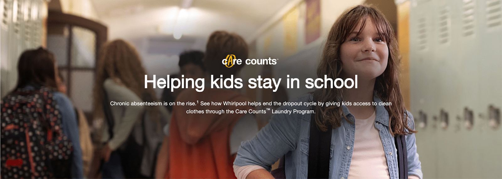
How could they improve the ad? Maybe use that image and just say Care Counts: Helping kids stay in school <See How>. Honestly, even if they just added that copy to the original ad, it would be a huge improvement.
Adobe
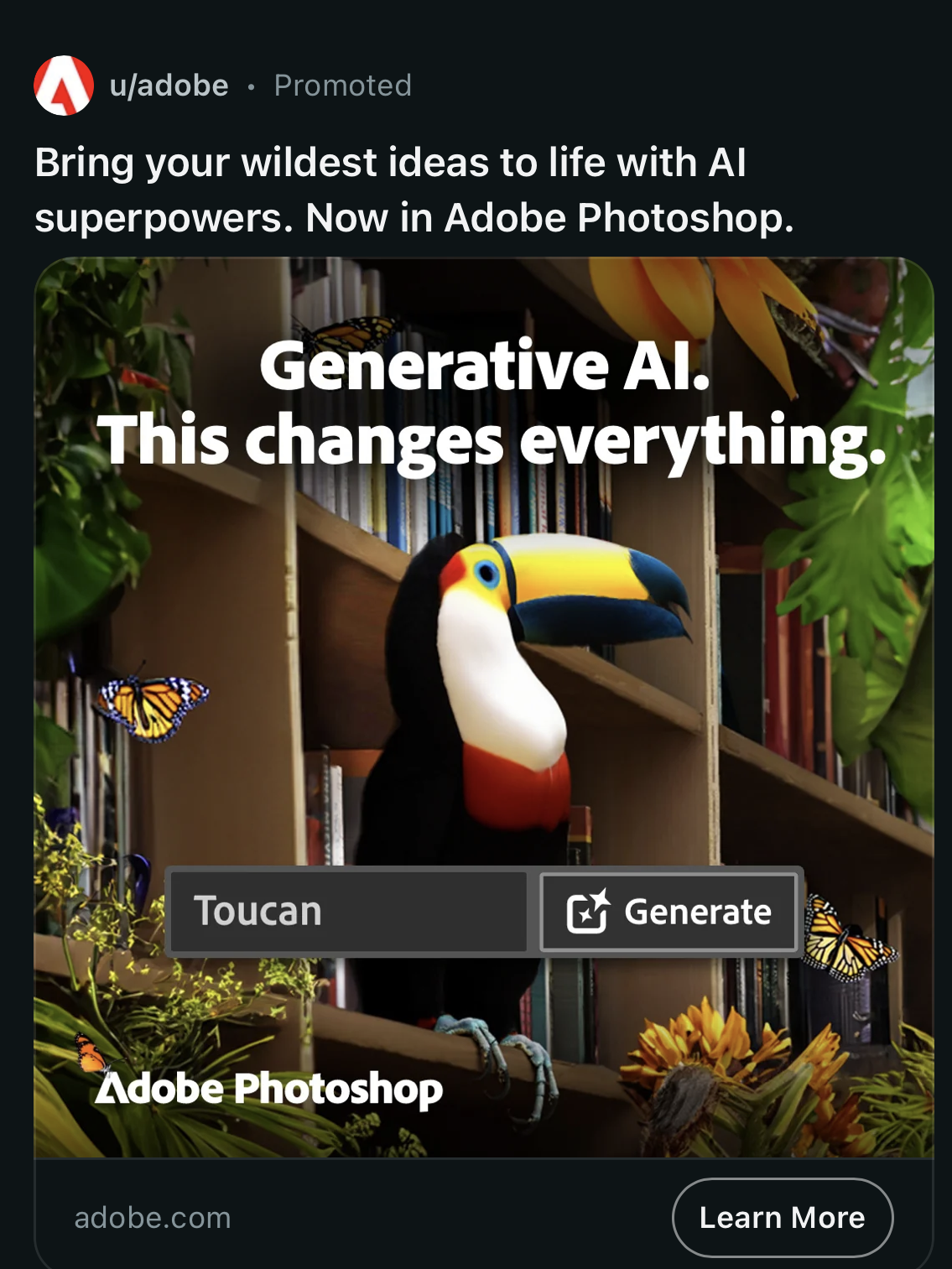
POV: your “wildest idea” is a toucan sitting on a bookshelf.
Anyway, I generally like Adobe/Photoshop ads. As a dad, though, this one hurts my heart due to the missed opportunity. Instead of Generative AI. This changes everything., how about:
With Generative AI, Now Toucan.
Get it? Now Toucan? Now you can? Come on!
In Summary
The world is cyclical, and so is this article. You want good ads? Focus on clarity of message and brand above all else. Now go define your message.
