Brands should have the power to become ubiquitous. From brand strategy through to identity, it’s important to allow for context and growth. Whether you think it’s important today or not, if a brand has the capacity for growth, you need to prepare. Here’s a quick, simplified guide to print and web color and how to get what you want (and what you need) when designing color.
Let’s first lay some groundwork. For the purpose of this article, let’s say there are two types of light (generally speaking), reflected light and projected light.
Reflected Light – Exactly what it sounds like, light bouncing off of a surface and sending
waves that our eyes interpret as color.
Projected Light – Everything that emits lights from a screen or display.
Why should you care? Because those two different ways light “creates” color require two different approaches to design – one for print and one for digital. When I’m designing brand systems, I have to take both of these approaches to color into consideration. I do that because I want to make sure the client has everything they need to design print collateral that will have accurate color representation across substrates, while also being able to build out the brand in the digital space for product design or web design.
Let’s dig into reflected light first.
I got my start in the design industry about twenty years ago. My first real job was a prepress manager at a print shop in Nashville. About 90% of my responsibilities was to accept random files from customers and get them prepped for printing. Most of the time the files that the customers provided were a complete mess, so I ended up having to do a fair amount of work to get things to print the way the customer wanted. I became intimately familiar with the reflected light color gamut pretty quickly.
When people think of printing at a professional print shop, they’re usually thinking of offset lithography. And that printing process has just 4 basic colors to choose from to create thousands of colors. Those colors are cyan, magenta, yellow, and black and they’re referred to as CMYK (the K stands for “key” or “key plate” and it typically uses black ink).
What am I going into such detail here? Because you need to know the basics of how it all works so this next part makes sense.
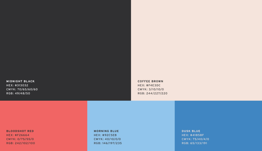
When I’m building the print color specs in a brand guide, it often looks something like this…

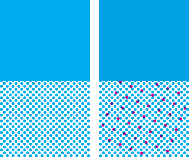
Those 5 colors above have very specific CMYK percentages that will tell the printer how much of each of the individual CMYK colors to add to achieve the desired end result. If we were to use 100% cyan by itself, it looks like this…

But cyan with a little magenta added looks like this…

Those two colors look super similar on screen, but if you print these colors and zoom in closely, you’ll see something called a rosette pattern.

That pattern is the mark the printer makes when it sprays the ink onto the paper. And you can see on the left that that’s 100% cyan, but the color on the right has just a little magenta mixed in. Those color values are super important to get right. If you just want pure cyan to print, but you accidentally left a little magenta in there, it’ll show up in the rosette pattern and make the color a little muddy and less vibrant.
Clean Up CMYK for Print
Oftentimes when a designer picks a color to add to a brand guide, that color might look great on screen, but that color’s CMYK formula might look something like this – “C98.765, M2.258, Y0, K0”. Designers need to make sure that their print colors are actually the colors they want to see. A better formula would be “C100, M0, Y0, K0”, if full cyan is the goal.
Now let’s talk about projected light.
Designing color for print is more about accuracy, but designing color for the digital space is more about usability.
Where reflected light mainly lives in the CMYK space (I’m completely excluding PMS/spot colors for the sake of brevity), projected light lives in the RGB (Red/Green/Blue) space. In some ways, picking colors for the screen is way easier, because you’ll mostly get what you see when you pick color in whatever design software you’re using. There are exceptions to that, of course, and those exceptions need to be taken into account. For example, certain web browsers render color differently than others, computer and phone screens aren’t all calibrated the same way, and the web friendly color gamut isn’t quite as broad as our screens color gamut.
Designing color for print is more about accuracy, but designing color for the digital space is more about usability. And that leads me to my next point. When building out a brand color system for product design, you need to utilize something called color ramps.
Color Ramps for UI
Color ramps are essentially color scales that specify value gradations. We build color ramps so that the design team will have lots of options to choose from when designing the myriad UI components needed when building products/websites.
If we go back to our 100% cyan example, we can use that one color to set a point in that specific color ramp. Because our example color is kind of right between the darkest point and the lightest point, we’ll just place that in the middle of our color ramp. If the color we’re using is much lighter, we’ll place it on a higher point in the ramp.

If we add a color ramp to each of the primary brand colors we’ve chosen to create the initial brand system, we can ensure not only that whatever digital product that’s created stays on brand, but it also equips the team with all the necessary color resources they need to do their job.
Make Better Design Decisions
I’ve left a lot of detail out, but hopefully this brief breakdown will help young/aspiring designers made better choices. Think about current and potential context and use cases to build better, stronger design for your brand.

