I’ve talked about identity design here before. In that article, I described how an overall visual identity can communicate brand meaning whether or not that brand has a strong logo. So let’s pick a brand we worked on and spend some quality time with the logo.
Introducing Agency VA, a virtual assistant solution that allows its customers to hire, manage, and pay remote workers all from its platform. They were really growing fast and their original logo couldn’t keep up. The design execution was somewhat clumsy, but it doesn’t matter if I “like” or “dislike” a logo. Asking if a logo is “good” or “bad” doesn’t make sense to me. The better question is does that logo function properly or not? In this case, the original logo simply didn’t function properly: it was hard to read the name of the company quickly, it didn’t communicate the brand’s personality in any way, and the mark didn’t feel like it could hold up on its own without the name.
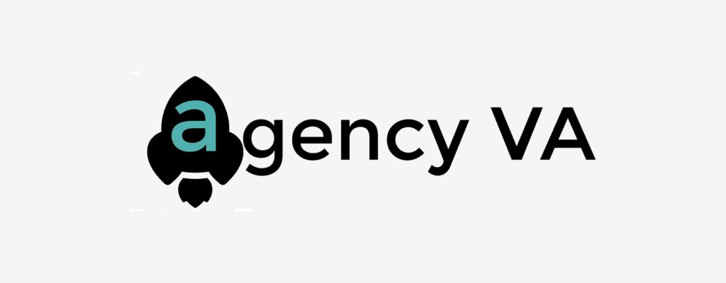
The idea here isn’t bad. A rocket ship is a cool symbol. And because they had already started to establish a reputation, we don’t want to totally blow up the brand. Instead, we want to treat this more as an evolution than a total rebrand. So what can we do to lean harder into this idea?
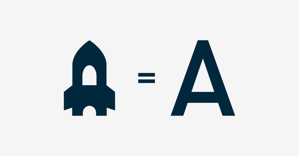
Let’s rework the rocket ship so it actually takes on the shape of an “A”. The symbol still reads as a rocket ship, but now we have a more subtle meaning behind it. Now the ship itself needs something to help contain it.
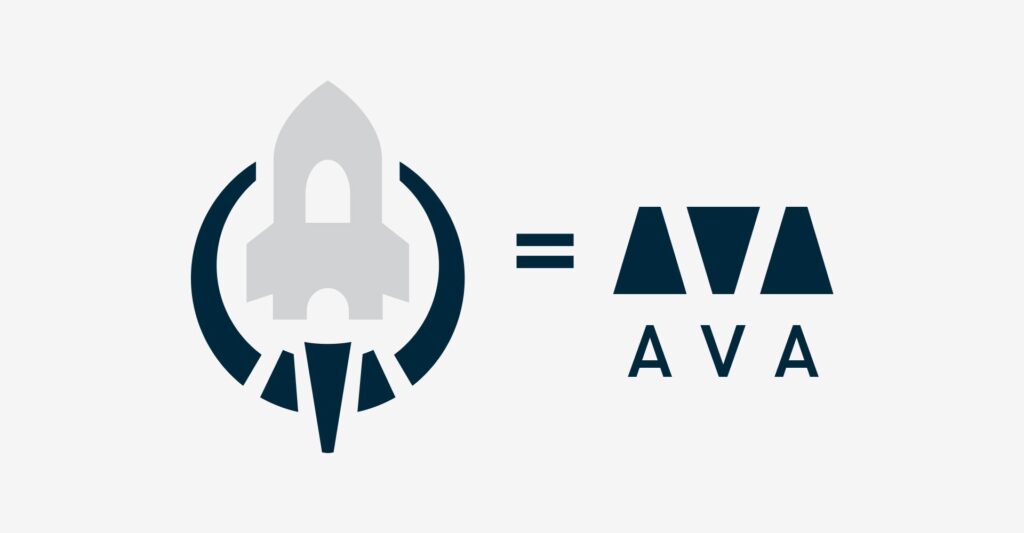
Let’s add a circle around it so that it functions more as a standalone icon. And because I love an easter egg, let’s subtly add an “AVA” in the rocket propulsion flames.

We can keep their original color palette because, again, this is an evolution not a total rebrand. But let’s update the colors to be brighter and include a gradient for a more modern take. And if we tilt the logo forward a bit, the symbol starts to take on motion and more meaning. One of my favorite spatial metaphors is “good is up and good is right,” and this rocket ship being tilted in this way subtly links this symbol to a moral evaluation.
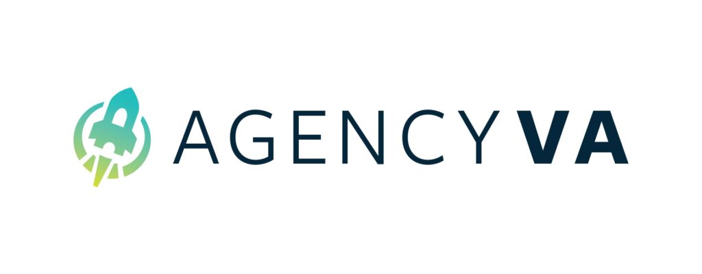
Let’s update the type to make it easier to read while adding authority and nimbleness and we’re done!
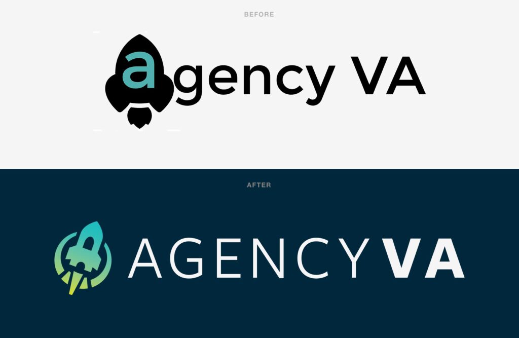
A logo refresh can really take a brand far. Sometimes great ideas are limited by execution that is not great. It’s worth a closer look to make sure the brand idea is expressed properly.
